


ncu FY2013 Annual Report 14

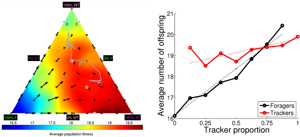
Figure 3.3.2: DiFinetti diagram of the directions and magnitudes of the changes in subpopulation proportions for the three phenotypes, strong stayers (SS), weak stayers (WS), and roamers (R). The small blue circles indicate the tested phenotype proportions. The red arrows show the average direction and magnitude of the change in phenotype proportions (magnified by a factor of five for visualization purposes). The green line, starting in the black circle and ending in the black triangle, shows the phenotype proportions in final 20 generations of the evolutionary experiments. The gray-scale coloring visualizes the average population fitness.
Copyright OIST (Okinawa Institute of Science and Technology Graduate University, 沖縄科学技術大学院大学). Creative Commons Attribution 4.0 International License (CC BY 4.0).


